Role
Creative Direction / Design
Creative Direction / Design
Challenge
Create distinctive, versatile logos from the ground up—working closely with clients to understand their brand, audience, and marketing goals. Each logo needed to communicate clearly, feel authentic, and perform seamlessly across varied applications.
Create distinctive, versatile logos from the ground up—working closely with clients to understand their brand, audience, and marketing goals. Each logo needed to communicate clearly, feel authentic, and perform seamlessly across varied applications.
Solution
Transformed brand insights into clean, memorable marks—using bold symbolism, intentional geometry, and refined typography to craft identities that resonate and endure. Designed each logo to be flexible and scalable, ensuring consistent performance across digital and print environments.
Transformed brand insights into clean, memorable marks—using bold symbolism, intentional geometry, and refined typography to craft identities that resonate and endure. Designed each logo to be flexible and scalable, ensuring consistent performance across digital and print environments.
Tools
Adobe Illustrator
Adobe Illustrator
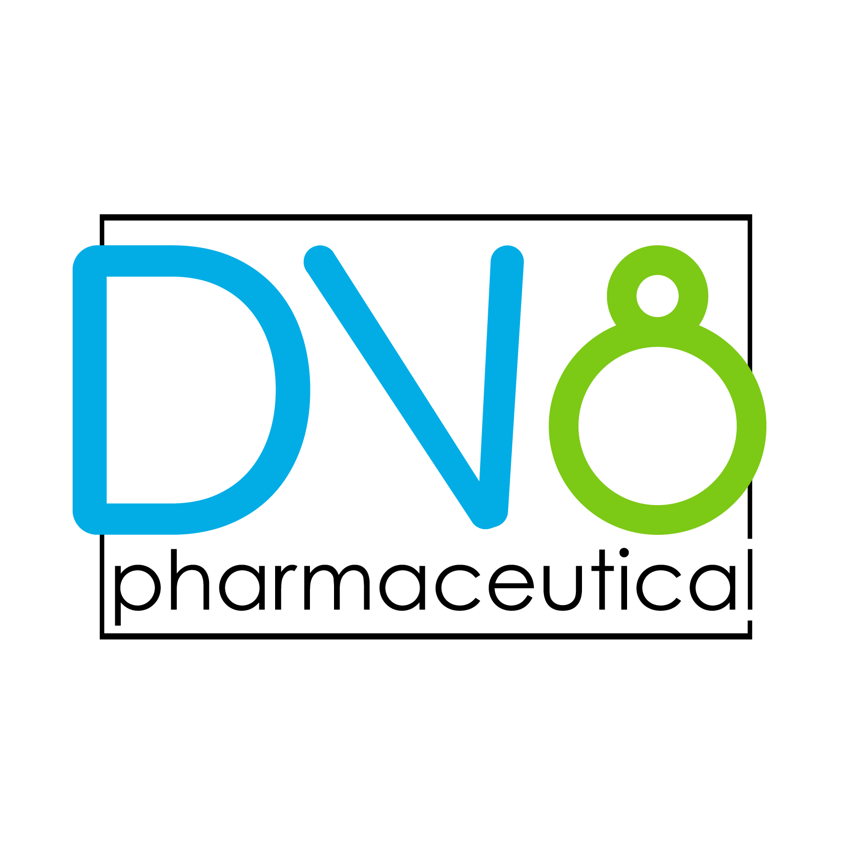
Logo for DV8 Pharmaceutical, blending bold geometric letterforms with a clean, modern aesthetic. The design uses vibrant color contrast to convey innovation and approachability, with a clever integration of the number 8 to reinforce the brand name’s theme of “deviation.
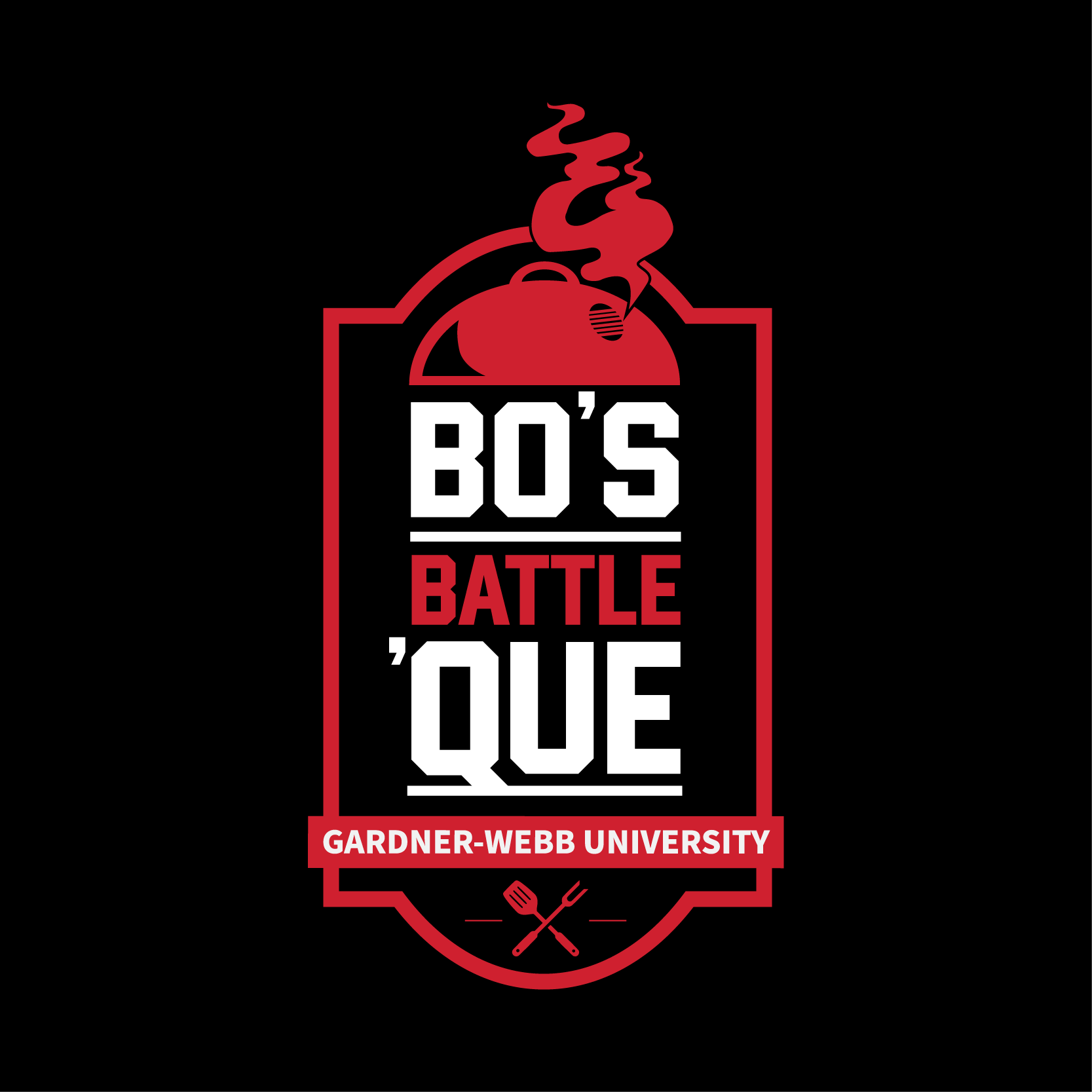
Logo for Bo’s Battle ‘Que, Gardner-Webb University’s signature barbecue event. The design features a bold badge structure with collegiate typography, a smoking grill icon, and crossed grilling tools to evoke school spirit and competitive energy while celebrating the art of barbecue.
Logo for Cyclops Audio, featuring a bold, minimalist “C” mark that doubles as a stylized eye—hinting at sharp focus and single-minded precision. The clean, modern typography reinforces the brand’s identity as a forward-thinking audio company.
Iconic bulldog logo designed as a bold, high-contrast emblem capturing strength, focus, and tenacity. The sharp linework and graphic style ensure instant recognition at any size, making it ideal for use across athletic branding and merchandise.
Pair of dynamic logos for Gardner-Webb Women’s Basketball, each combining bold typography with energetic textures and graphic basketball elements. Designed to evoke motion, intensity, and school pride while giving the program versatile branding options for uniforms, merchandise, and media.
Logo for Gardner-Webb University’s Men of Impact program, designed to convey strength, growth, and belonging. The badge-style mark features a bold forest silhouette and warm sunset gradient, symbolizing community and personal development, anchored with classic typography for institutional credibility.
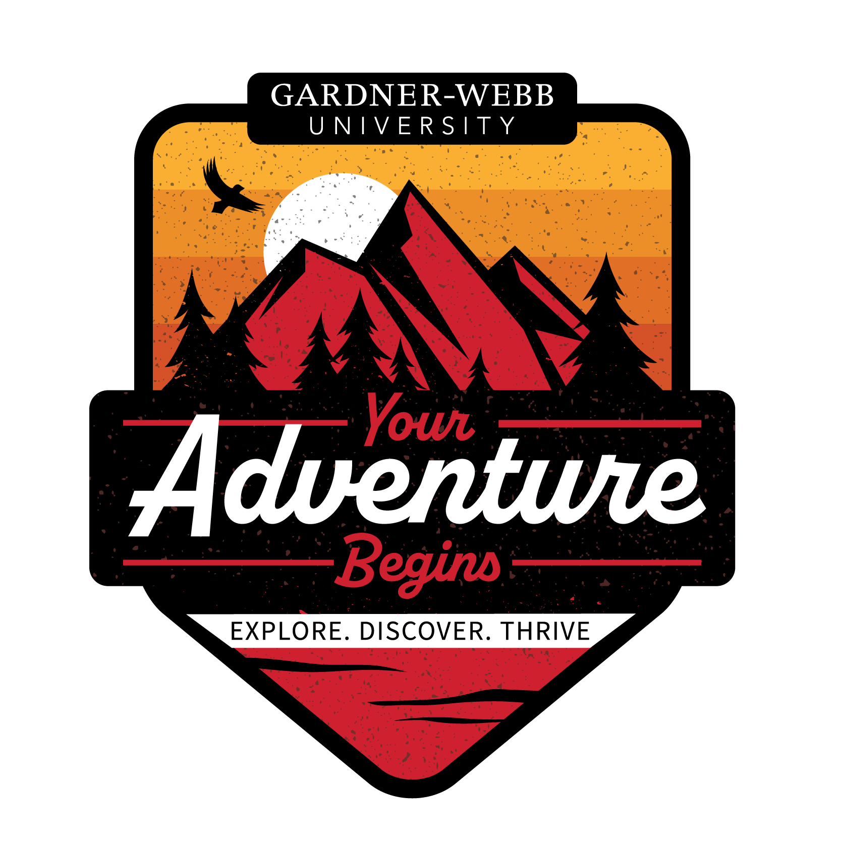
Logo for Gardner-Webb University’s New Student Orientation program, designed to inspire excitement and a spirit of exploration. The badge-style mark features bold mountains, pine trees, and a soaring bird set against a warm sunset palette, reinforcing themes of discovery, growth, and new beginnings.
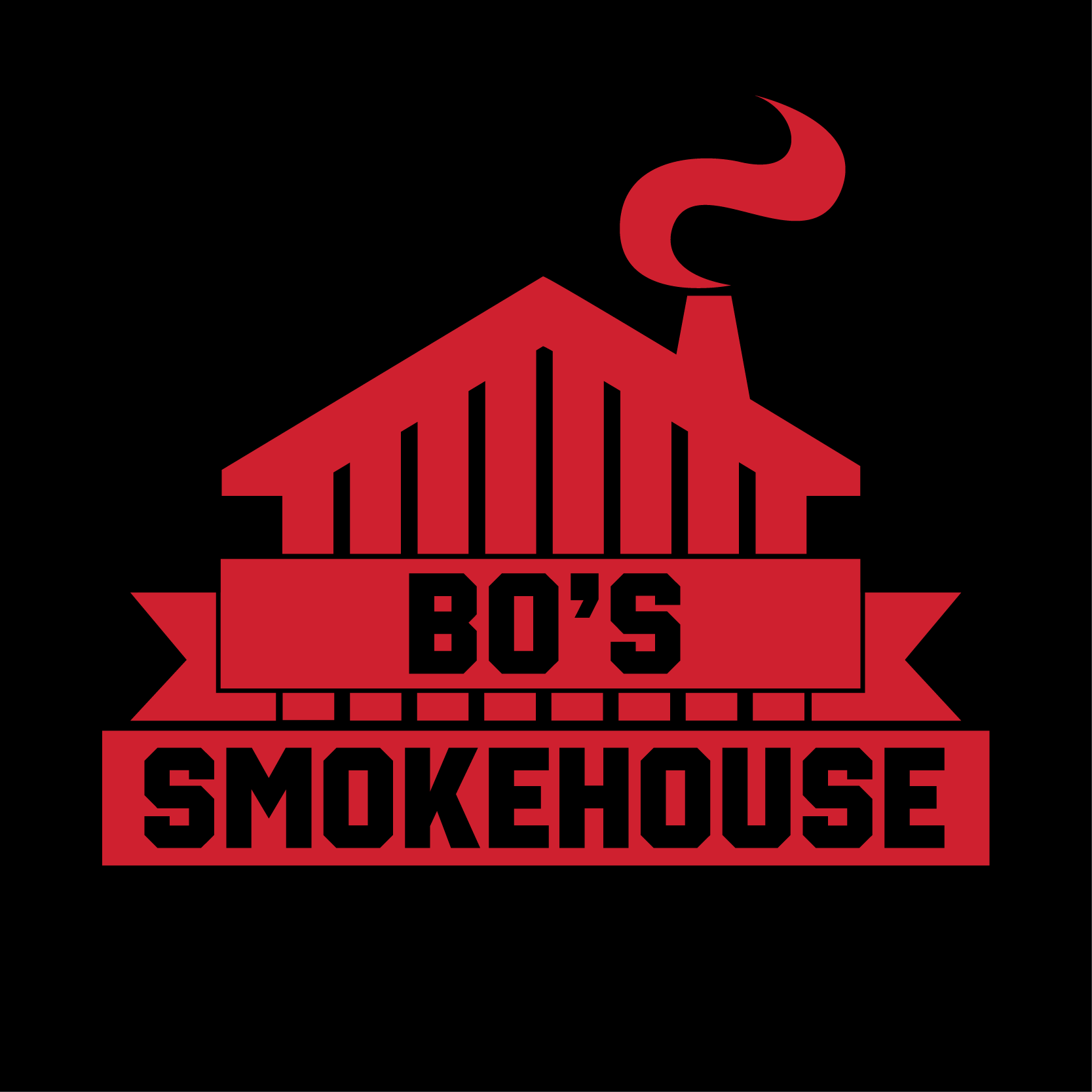
Logo for Bo’s Smokehouse, Gardner-Webb University’s on-campus BBQ restaurant. The mark features a bold, geometric smokehouse silhouette with a prominent banner and stylized smoke plume, designed to evoke rustic warmth, campus pride, and authentic Southern barbecue tradition.
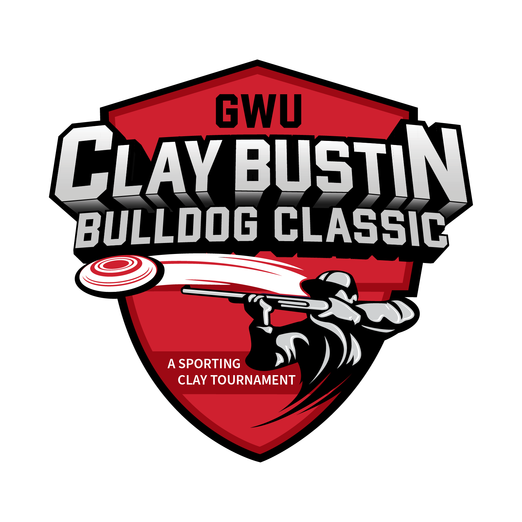
Logo for the GWU Clay Bustin Bulldog Classic, a sporting clay tournament supporting Gardner-Webb University. The bold shield design combines dynamic typography with an illustrated shooter and clay target in motion, capturing the competitive energy and outdoor spirit of the event.
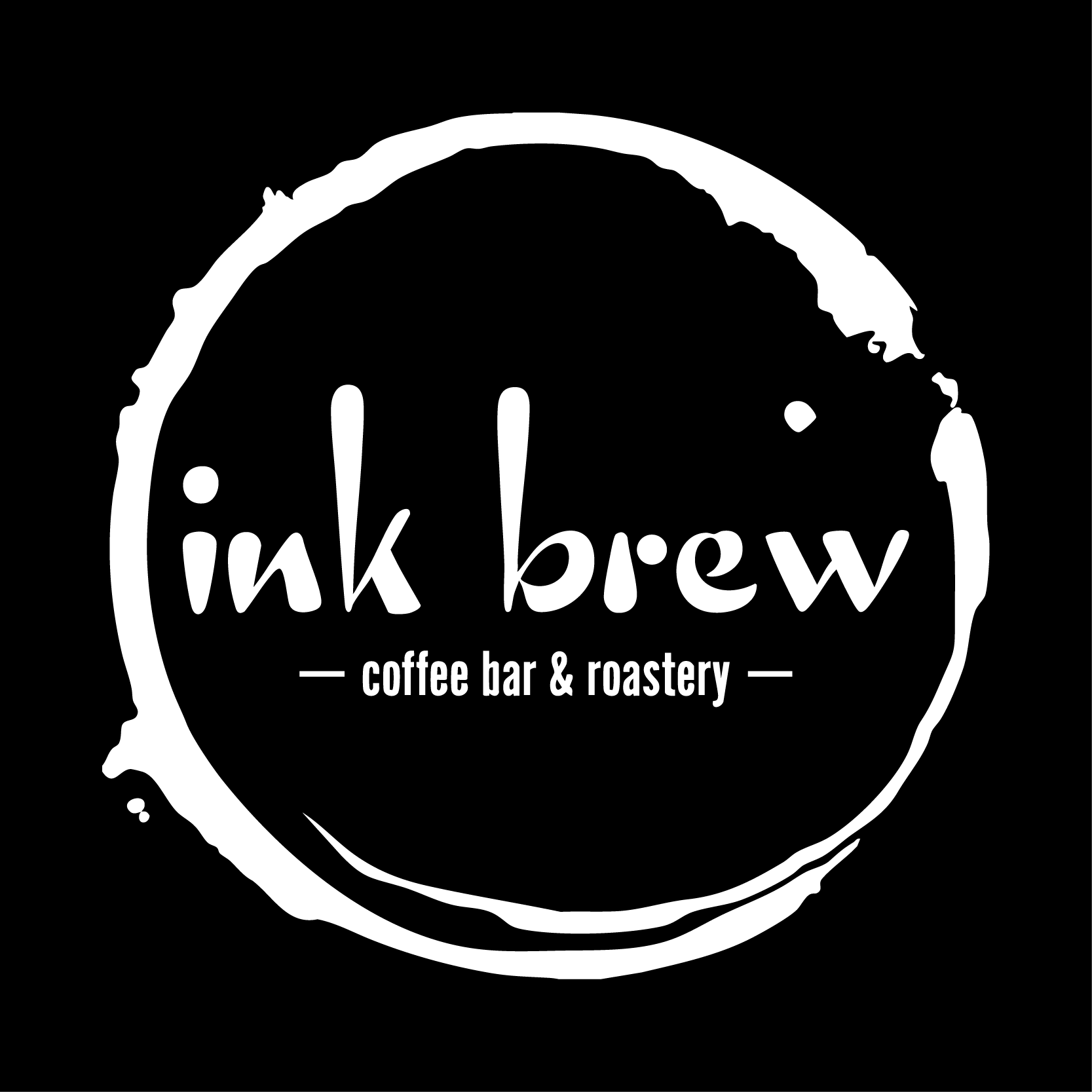
Logo for Ink Brew, a coffee bar and roastery, designed with a hand-crafted aesthetic that blends creativity and coffee culture. The expressive, ink-like typography and organic coffee ring motif evoke warmth, artistry, and an inviting café atmosphere.
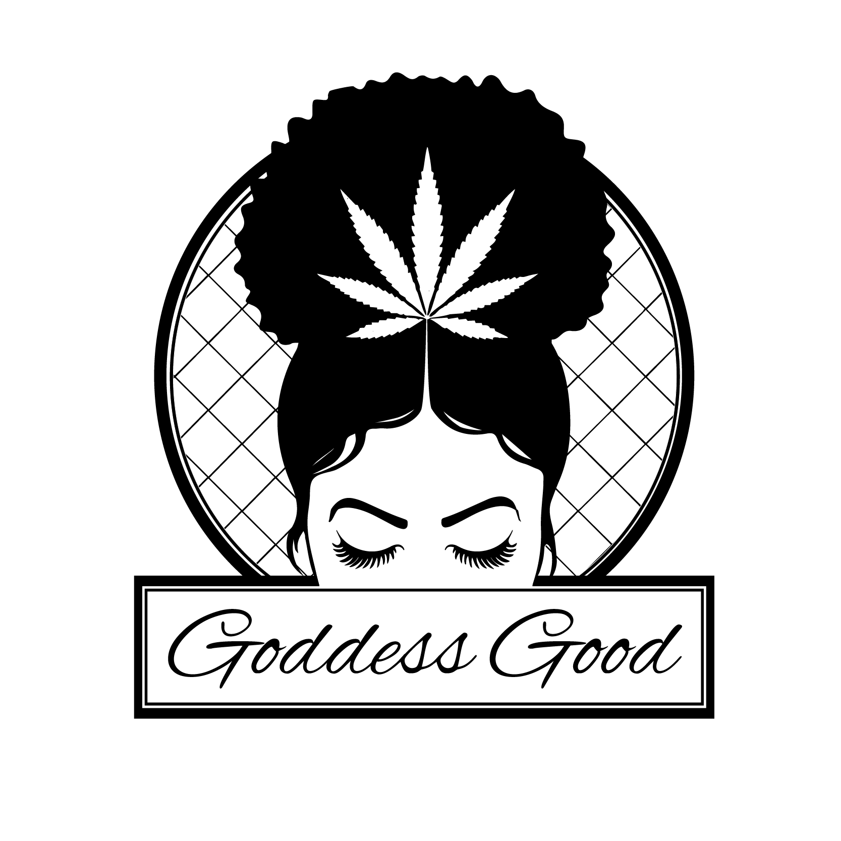
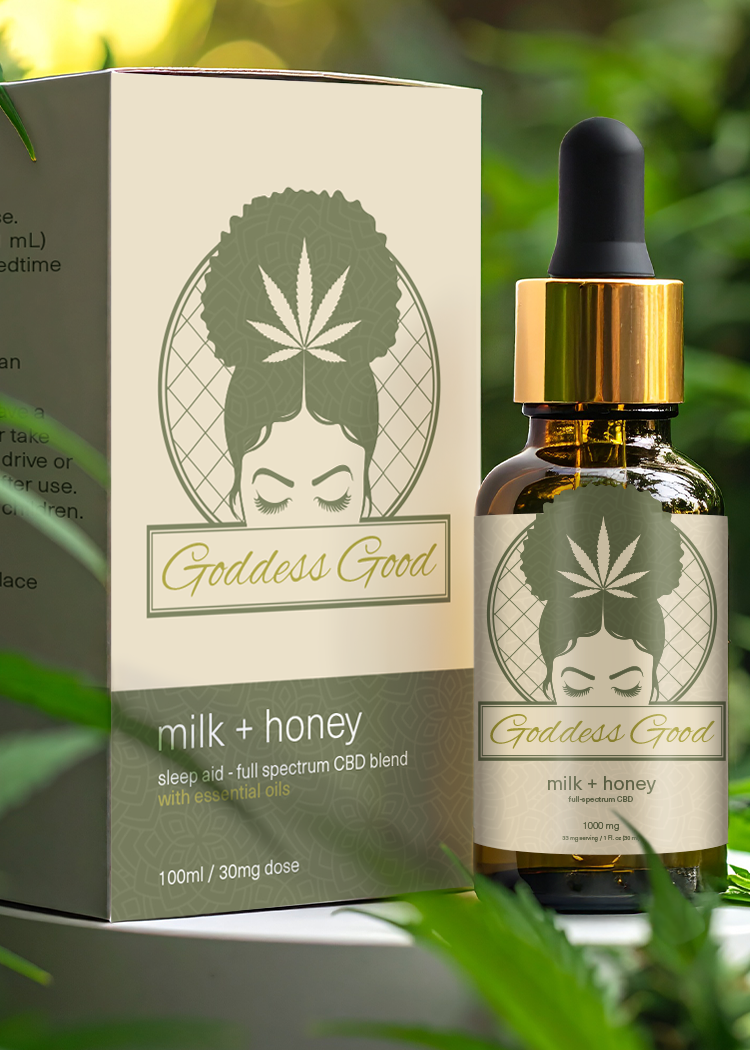
Logo for Goddess Good, a female-owned, Black-owned boutique hemp product line. The design features a striking female silhouette crowned with a cannabis leaf, blending elegance, empowerment, and cultural pride while reflecting a commitment to natural wellness and self-care.
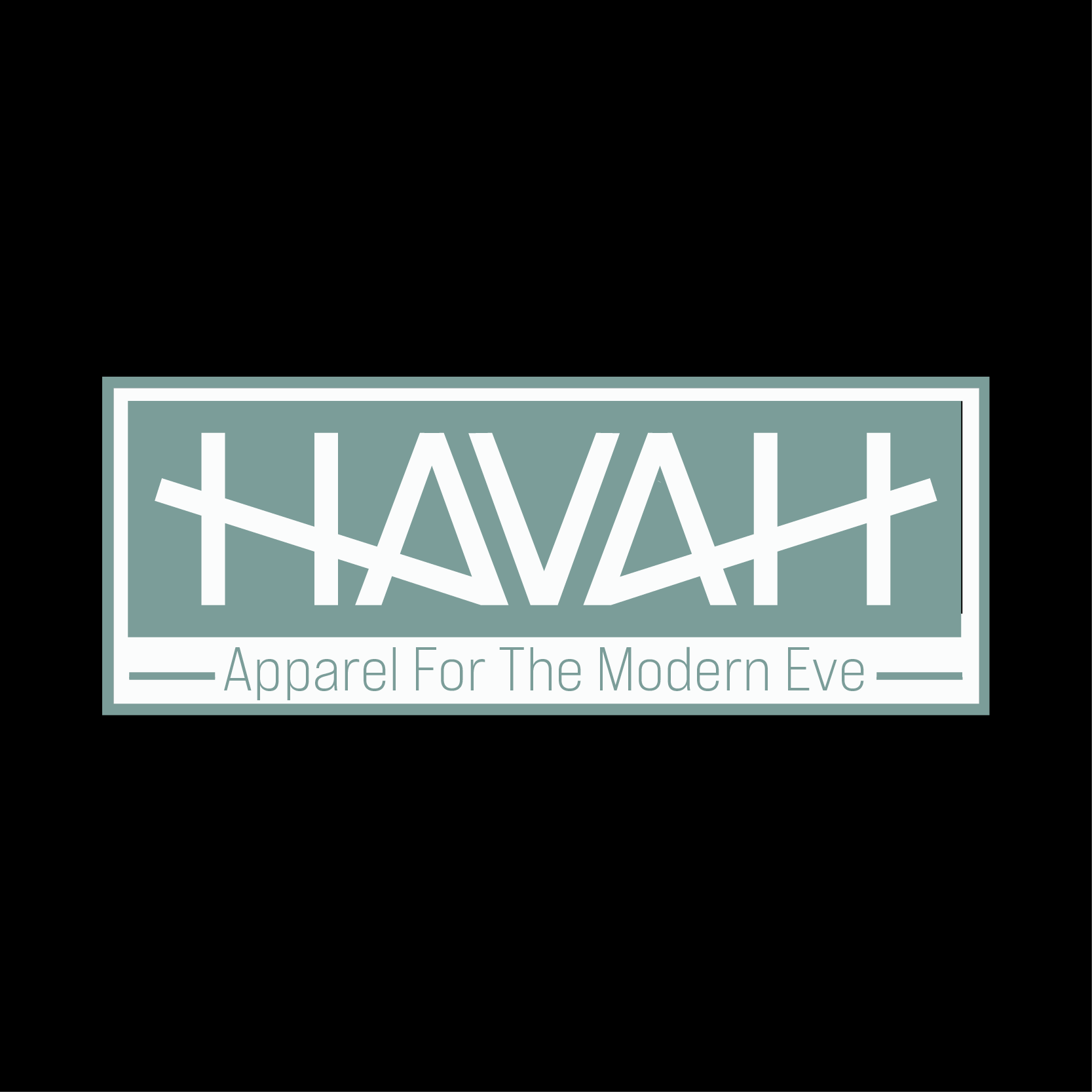
Logo for HAVAH, an apparel brand designed “for the modern Eve.” The name Havah—Hebrew for “Eve,” meaning “life” or “living”—reflects the brand’s inspiration: honoring the original “mother of all living.” The bold, geometric typography emphasizes that HAVAH is a palindrome, creating visual symmetry that reinforces the brand’s balance of tradition and modernity.
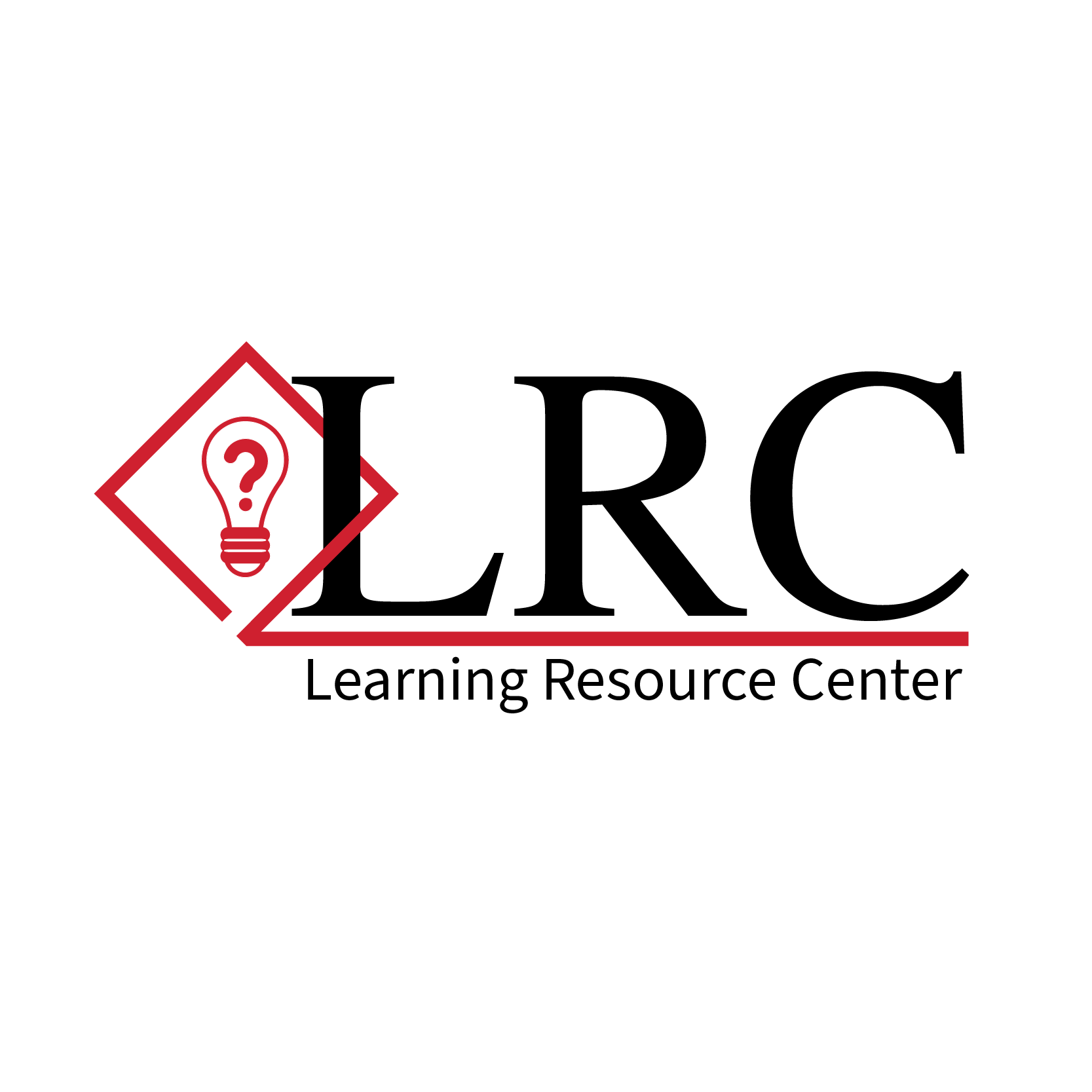
Logo for the Learning Resource Center, designed to communicate support, guidance, and curiosity. The classic serif typography conveys trust and professionalism, while the red diamond and lightbulb-with-question-mark icon symbolize inquiry, discovery, and student-focused learning.
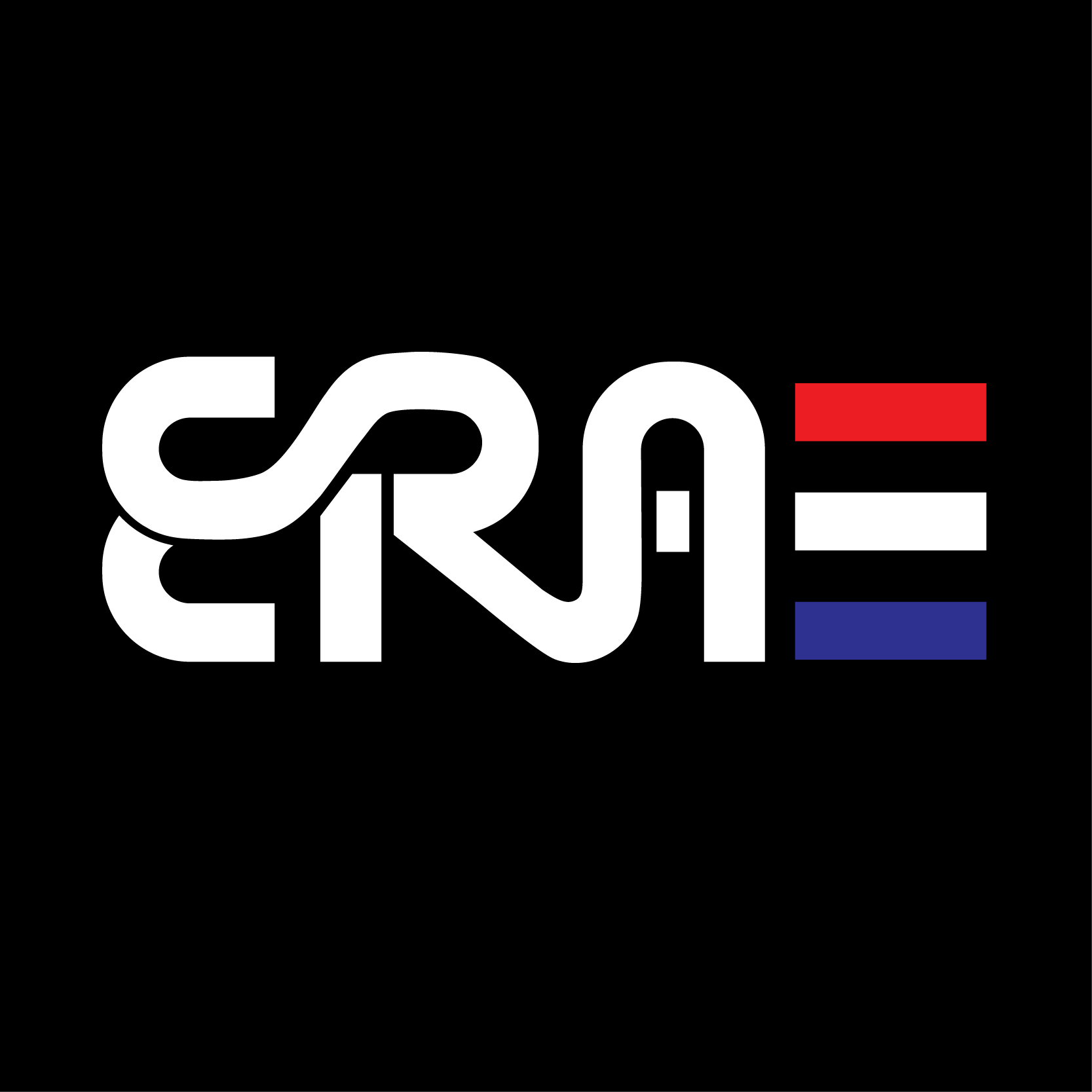
Logo for ERA, a USA-based sportswear company. The custom interconnected letterforms express motion, energy, and modernity, while the red, white, and blue color bars reinforce the brand’s American identity. Designed to feel dynamic and versatile, reflecting the company’s focus on performance-driven apparel.
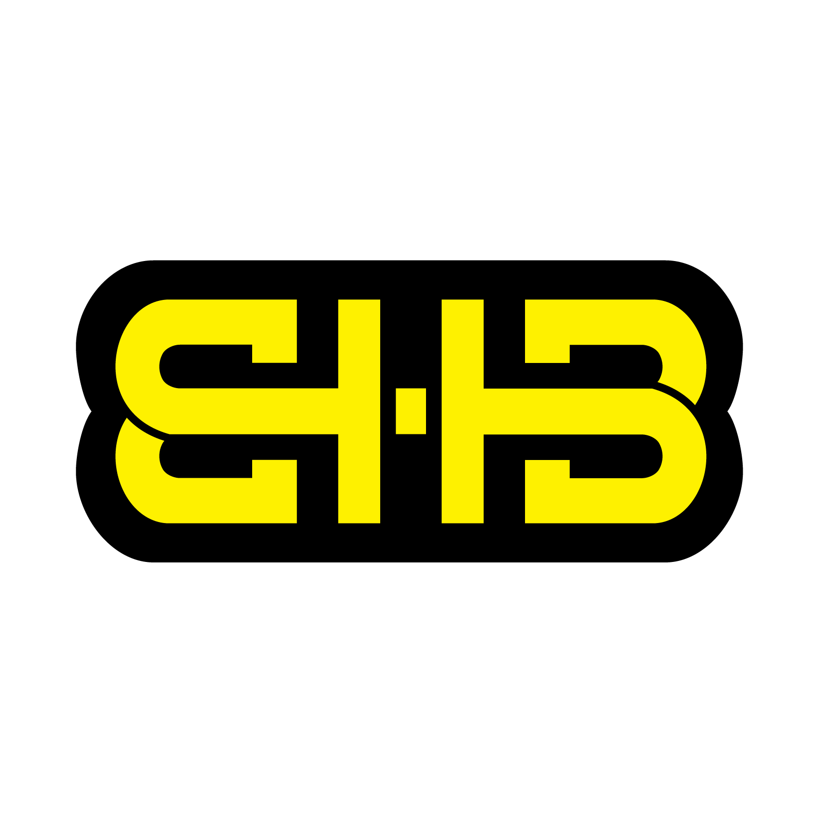
Logo for EHB Manufacturing. The bold interlocking letterforms and yellow-black palette evoke industrial strength, reliability, and performance—positioning EHB as a trusted name in construction, fabrication, and heavy industry solutions.
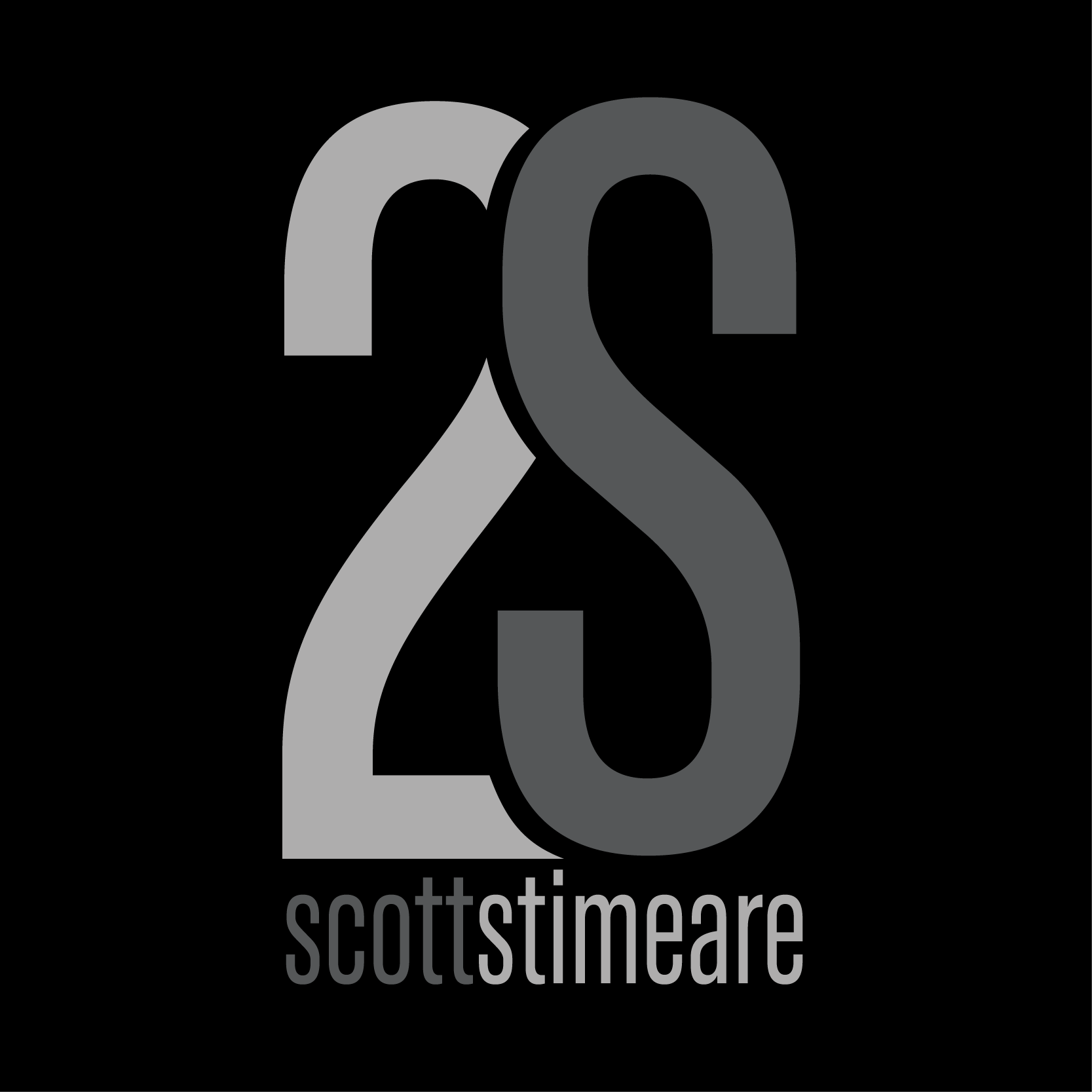
Personal monogram logo for Scott Stimeare, featuring an overlapping “2” and “S” in a minimalist grayscale palette. The clean, modern typography and bold geometric composition create a strong, professional mark that reflects a refined and contemporary personal brand.
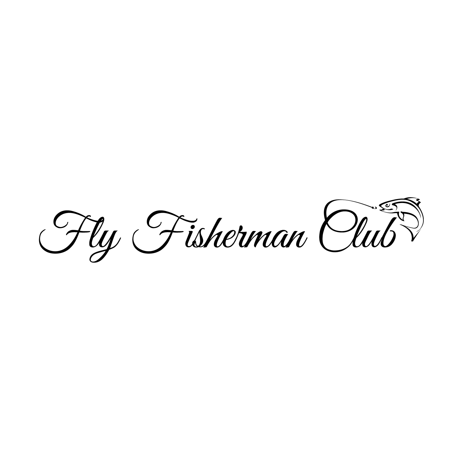
Logo for Fly Fisherman Club, combining elegant script typography with a minimalist line illustration of a leaping fish and fly line. The design conveys a sense of tradition, refinement, and passion for the art of fly fishing, appealing to an audience that values both sport and craftsmanship.